
This document is here mostly for historic purposes. Although the information about XHTML and CSS should remain accurage (as of 2010 August), I do minimal web design now and am unlikely to further maintain this page.
This tutorial is intended to be a fairly comprehensive guide to the concepts involved in writing a web page by hand. It will cover the the structure of XHTML and CSS as fully as possible, and will introduce a core of their vocabularies, but it will reference other sites for full listings. Where appropriate, it will touch on other useful tools, but the focus is on XHTML and CSS.
Throughout the text, there will be a number of links; these will also appear collected at the end of each section, for reference. Also, as you read, watch for text like this — if you leave your mouse over it for a few seconds, a tooltip with more information (or some side commentary) should appear.
This document was written with XHTML 1.0 (Strict) and CSS 2.1 in mind, in February and March of 2005. As standards change, it may go out of date.
For the most part, if you know HTML, you know XHTML. (If you don't know HTML, you can skip this section.) The major differences arise because XHTML is stricter. (This is a good thing: there are fewer ambiguities in the code, which means that you can be sure of how the code you write should get treated. In general, this is true of standards: It's good to be standards compliant, because the more the standards are adhered to by both coders and browsers, the more likely it is that what you write will turn into what you intend.) The move to XHTML is also good for forwards compatibility, meaning that if you switch over, your page will last longer as standards continue to get updated. Anyway - the differences are as follows:
html PUBLIC "-//W3C//DTD XHTML 1.0 Strict//EN"
    "http://www.w3.org/TR/xhtml1/DTD/xhtml1-strict.dtd">

<html xmlns="http://www.w3.org/1999/xhtml" lang="en" xml:lang="en">
For extreme detail, you may want to see the Differences with HTML 4 section of the W3C XHTML Recommendation. Additionally, you could check out ALA's article Better Living Through XHTML, and the concise XHTML Guidelines found in NYPL's online Style Guide. Lastly, as you convert your page or write a new one, you might want to make use of the W3C XHTML validator.
(A note on the header: It might be different, depending on language and type of XHTML. I've chosen to use the English / XHTML 1.0 Strict one as an example, since that's what I'm using for my pages and for this example. See the W3C recommendations for notes on the 'flavors' of XHTML.)
So, what is this stuff, anyway? Let's start with HTML, and go from there.
HTML: HyperText Markup Language. It's a language used (as the Wikipedia Article on HTML puts it) to add metadata to documents. For example, instead of just a plain text document, you get a text document which has the text divided into useful chunks that a HTML user agent can do things to: a paragraph here, a link there, a list in between, and — if you want to get fancy — some images, or worse. The point is that HTML takes a string of undifferentiated text and makes it so the computer reading it can separate out chunks to do things to, be that assigning actions or colors or sizes or anything else. (It used to be that everything about the appearance was specified through the HTML; now, CSS does that, using the HTML to reference specific parts of the document.) The typical HTML user agent is a web browser on a personal computer, but it could be any number of things — for example, cell phones sometimes have web browsers.
Once you've got the information divided up into bits, you have something which looks sort of like this, conceptually; boxes inside boxes:
Some text
Some more text
A link to hereInstead of a set of nested containers, you could also think of an HTML document as a tree. The two are pretty much interchangeable, but because of they way HTML (and CSS) are actually structured, I find the nested-boxes approach more natural.
So how do we get whatever's oozing around the web looking at HTML documents to see our beautiful chunks? The answer is tags: HTML is, very simply, a bunch of little tags that go around whatever other text is present. For example, this paragraph resides between <p> and </p>, the begin- and end-paragraph tags.
In most cases, there are two actual tags for any conceptual HTML element: the paragraph element as you just saw it; the division element with <div> and </div>; <body> and </body> for the main part of the HTML document, and even <html> and </html> that surround the entire document. In HTML proper (up through 4.0), there were also some bacheloric tags: <br> created a line break all by itself,
<img src="imagefile.jpg" alt="pretty picture">tucked a smiling face or a flower into the page. In XHTML, however, all tags must act as if they're paired, so you don't have things that start and never end — thus the relevance of the box model. As stated in the HTML/XHTML differences section, <br> becomes <br />, and images change from the first to the second:
<img src="imagefile.jpg" alt="pretty picture">
<img src="imagefile.jpg" alt="pretty picture" />
the difference in each case being the closing slash. Such elements are called self-closing.
The other aspect of tags, which I've shown but not yet talked about, is attributes: things that tell the browser a little more about whatever's in the tag. For example, the source (src) of an image file, alternative (alt) text to replace the image with if it can't be displayed, the class of an element (used extensively for CSS), &c.
That's pretty much it: you're ready to start building a page. The very simplest page looks like this:
<!DOCTYPE html PUBLIC "-//W3C//DTD XHTML 1.0 Strict//EN"
    "http://www.w3.org/TR/xhtml1/DTD/xhtml1-strict.dtd">

<html xmlns="http://www.w3.org/1999/xhtml" lang="en" xml:lang="en">
<head>
<title>Title of the Page</title>
</head>
<body>
<p>An insightful (if short) paragraph.</p>
</body>
</html>
If you want, this code is also available as a separate file; control- or right-click and save it to disk for your editing pleasure.
Now it's time to learn all the tags — or at least time to learn the most useful ones, and remember where to find out about other ones. I highly recommend The BareBones Guide to HTML, which is what I used as my reference while learning HTML. You could also look at the W3C's HTML 4.0 Recommendation, which is a little denser, more official, and generally about the same.
One of the best resources, though, is the web at large: look at the source for web pages you run across, and figure out what they're doing. If you're using Safari, hit cmd-opt-v (switched to cmd-opt-u, to match Mail, by v2.0 if not earlier); for Firefox, control-u; and if you're using MS Internet Explorer, alt-v-c.
So, take a quick break from reading, and have a look around, and see if you can make sense of what you're looking at. Look at this page's source (the beginning is heavily commented, meaning I've put in some description in <!-- HTML comments -->), and that of any other pages of mine you feel like investigating, and maybe the source for A List Apart — There's no limit to what you can look at, but not all sites have pretty code.
If you're feeling adventurous, you should try writing some code too, although I admit that without CSS it's not that much fun. You can copy the basic XHTML file's code into a text document, and go from there. Under MacOS X, I would recommend using TextEdit, unless you're adventurous and want to try out a command line editor like vi or emacs. (In TextEdit make, sure you're in Text Only mode, and save the file with a .html extension; then drag it to Safari to see what you have.) If you're using Windows, you'll want to use Notepad (reportedly one of the best HTML editors around), again saving with a .html extension. (Under Unix/Linux, you can start emacs with a GUI by opening a terminal and typing "emacs &"; you could also use OpenOffice.org, but make sure it doesn't know you're doing HTML, or it'll try to help you along. I'm not actually going to talk about using specific tags until I start on a proper example — coming up next.
As promised, here are the various links I've referenced throughout this section — or at least all the important ones — as well as a couple other interesting and useful sites. Note that although we don't want to be writing HTML, all the tag names and definitions are the same in XHTML, so the old references are still useful.
The first thing to decide, when writing a web page, is what will be on it. For this tutorial, I'm going to do a portfolio site for the work I did in Digital Design Foundations. The basic structure, however — and surely the concepts involved — should be applicable in many other situations.
More specifically, for this web page, I want the following. Some sort of splash screen — a pretty 'home' screen when people first arrive. Sub-pages for each of several projects, each involving a thumbnail gallery (if applicable) and a description of the project. A page with other info - contact, about the class, that sort of thing. Finally, of course, I will need a menu to get between pages. (Depending on how I feel, I may also make sub-pages for individual images, or I may just let them open up on their own.)
Because I'm going to do all the style with CSS, I'm not going to worry much at all about how the site will look yet. If I decide later I need to add some HTML to support the design I want, I can go back and add it.
Before starting in on writing HTML, I would recommend you look again at my commentary about text editors — at least, if you skipped it before. Mostly, just make sure whatever you're using doesn't try to help you write the code.
Because they're the meat of the site, I'll start with the project gallery pages. They should have the title (at the top, most likely, perhaps in a cool-looking header), a navigation menu (probably to the side, but as with the title, we can leave that to the CSS), the thumbnails, and a description of the project. Translated into code, starting with the basic document given before, that looks like this (separate file):
<!DOCTYPE html PUBLIC "-//W3C//DTD XHTML 1.0 Strict//EN"
    "http://www.w3.org/TR/xhtml1/DTD/xhtml1-strict.dtd">

<html xmlns="http://www.w3.org/1999/xhtml" lang="en" xml:lang="en">
<head>
<title>Mark Fickett | DDF | Project 1</title>
</head>
<body id="project1gallery">

<div id="title">
<h1>Digital Design Foundations</h1>
<h2>Mark Fickett, Fall 2004</h2>
</div>

<div id="menu">
<a id="home" href="home.html">Home</a>
<a id="about" href="about.html">About</a>
<a id="project1" href="project1.html">Project 1</a>
<a id="project2" href="project1.html">Project 2</a>
<a id="project3" href="project1.html">Project 3</a>
<a id="project4" href="project1.html">Project 4</a>
<a id="project5" href="project1.html">Project 5</a>
<a id="project6" href="project1.html">Project 6</a>
</div>

<div id="content">
<div id="description"></div>
<div id="thumbnails"></div>
</div>

</body>
</html>
So now the question, what's this mess we've produced? Well, it starts out just like before: a doctype declaration, so the browser knows what to do with the file. Then we have header information, for the moment limited to the title (which I've changed to something more interesting than "Title of the Page"), although the location of the stylesheet also goes there. Then we get to what the user will actually see — the body. Here there are a couple new things.
I know I said I wasn't going to do any style 'till later, but I've introduced something that wouldn't be there unless I were (as I am) planning on CSS in the near future: id attributes. (I'll talk about class attributes too, even though I'm not using any, yet.) These two attributes, unsurprisingly at least in the case of id, are for the purpose of identifying and thereby talking about elements. An ID is generally reserved for one element; a class is used to talk about any number of similarly treated elements.
Aside from adding some attributes of dubious occupation, not much is new. I chose to use <h1> and <h2> instead of paragraphs with id attributes for the title, since it's nice to use predefined elements, and those ones come with a little formatting which a CSS-incapable browser would appreceate. I mentioned <div> (a division) before: useful for dividing up the content of the page into sensible groups, so we can move them around together or make them look alike.
Links are new, but not overly complicated. The beginning specifies the HTTP reference, or href attribute, then comes the text that will be a link, and then the close tag. The only 'tricky' aspect of links is using relative or absolute paths. A relative path specifies the location of some resource with respect to the current document, so ../else/it.html would specify the document it.html in the else directory which itself is in the directory one level up from 'here'. (If this document is in a directory named handcodeweb, which is in turn in some other directory, then else must also be in that other directory.) Absolute paths specify the location absolutely: http://naib.webhop.org/etcaddress.gif, for example. You almost always want relative paths, so if your entire web site migrates (meaning the http://x.y.com/ part changes) all the URLs don't break.
So, how about another page? Let's do the title page. It won't be so exciting as HTML, since it's going to be fairly graphics-based; it will look something like this (separate file):
<!DOCTYPE html PUBLIC "-//W3C//DTD XHTML 1.0 Strict//EN"
    "http://www.w3.org/TR/xhtml1/DTD/xhtml1-strict.dtd">

<html xmlns="http://www.w3.org/1999/xhtml" lang="en" xml:lang="en">
<head>
<title>Mark Fickett | Digital Design Foundations</title>
</head>
<body id="index">

<div id="title">
<h1>Digital Design Foundations</h1>
<h2>Mark Fickett, Fall 2004</h2>
</div>

<div id="menu">
<a id="home" href="home.html">Home</a>
<a id="about" href="about.html">About</a>
<a id="project1" href="project1.html">Project 1</a>
<a id="project2" href="project1.html">Project 2</a>
<a id="project3" href="project1.html">Project 3</a>
<a id="project4" href="project1.html">Project 4</a>
<a id="project5" href="project1.html">Project 5</a>
<a id="project6" href="project1.html">Project 6</a>
</div>

</body>
</html>
Now, what happened here? Almost nothing changed. Actually, that shouldn't be surprising (okay, so I wasn't surprised). The requirements for the front page were title, menu, and some fancy graphics which we were leaving to CSS et. al. Because we have a couple characters showing up repeatedly, however, it's time to introduce something new: Server Side Includes.
Server Side Includes (SSIs) are processed by the web server before giving the files out to the client — probably you with a web browser. They can do a couple different things, but at the moment what we care about is includeing one file within another: specifically, including the menu's HTML code in several different pages, so we don't have to repeat the code, and so if we ever have to change the menu (ghasp!), we have to do it but once. I should mention that more or less the same outcome could be accomplished with frames, however I prefer SSIs. They allow bookmarking of specific subpages by the end user (so if someone sees a specific image they like in your portfolio, they can get back to it easily), are friendly to frames-incompatible browsers (such things must exist somewhere...), and I find them a more elegant solution.
The way I know of doing SSIs is with the Apache web server; I learned from the how-to in the Apache online documentation. To include one document within another, simply place the following in the body of the one that's including:
<!--#include virtual="stuff/toinclude.html" -->
Note that it's in an HTML comment, so if it fails to get parsed by the server, the client doesn't get bombarded with junk. Within the comment, there's the keyword that alerts the server that something's going on — #include (no space in --#) — and then directions for what to do: in this case, include the file toinclude.html located in the stuff directory which itself is in the same directory as the document doing the including. The included file need not be HTML, but if it's HTML code (as in the case of the menu), it makes sense to call it that, as opposed to .txt or something. Also note that depending on how the server hosting your page is set up, you may need to call documents with #include-s in them .shtml, make them executable (less likely; see the how-to), or do nothing at all (what I had to do, in the case of a Yahoo! page). I like the .shtml convention, because it saves server processing power and makes it easy to see what's going on for whoever's writing the code. (A downside to using includes is that it makes offline testing of the site more difficult.)
(Before going on, note that a similar result can be obtained using the object element. For example,
<object data="stuff/toinclude.html"><object>
embeds the file at stuff/toinclude.html, similar to frames. It's not as transparent as includes, and I've not used it much, so I'll stick with includes.)
So, if we change the gallery page to use SSIs, including both the header and the menu, it will look like this (separate file):
<!DOCTYPE html PUBLIC "-//W3C//DTD XHTML 1.0 Strict//EN"
    "http://www.w3.org/TR/xhtml1/DTD/xhtml1-strict.dtd">

<html xmlns="http://www.w3.org/1999/xhtml" lang="en" xml:lang="en">
<head>
<title>Mark Fickett | DDF | Project 1</title>
</head>
<body id="project1gallery">

<!--#include virtual="header.html" -->

<!--#include virtual="menu.html" -->

<div id="content">
<div id="description"></div>
<div id="thumbnails"></div>
</div>

</body>
</html>
And the menu and header, respectively, will look like this (separate header, separate menu):
<!-- begin header.html -->
<div id="title">
<h1>Digital Design Foundations</h1>
<h2>Mark Fickett, Fall 2004</h2>
</div>
<!-- end header.html -->
<!-- begin menu.html -->
<div id="menu">
<a id="home" href="home.html">Home</a>
<a id="about" href="about.html">About</a>
<a id="project1" href="project1.html">Project 1</a>
<a id="project2" href="project1.html">Project 2</a>
<a id="project3" href="project1.html">Project 3</a>
<a id="project4" href="project1.html">Project 4</a>
<a id="project5" href="project1.html">Project 5</a>
<a id="project6" href="project1.html">Project 6</a>
</div>
<!-- end menu.html -->
One last note: I like to put in comments at the beginning and end of the included file, so when looking at the parsed code I can tell where the various "physical" files begin and end. I won't go through the same process in such detail for the other pages (specifically, I won't go back to the front page), as it should be clear now how it works.
Now, one other page remains before we have skeletons for all the basic page types, and can fill in specifics and move on to CSS. Here's the useful-text page, including information about the page, any updates, and contact information. (Maybe a resumé too, if I'm feeling ambitious.) Code first, explanation coming up (separate file):
<!DOCTYPE html PUBLIC "-//W3C//DTD XHTML 1.0 Strict//EN"
    "http://www.w3.org/TR/xhtml1/DTD/xhtml1-strict.dtd">

<html xmlns="http://www.w3.org/1999/xhtml" lang="en" xml:lang="en">
<head>
<title>Mark Fickett | DDF | About</title>
</head>
<body id="abt">

<!--#include virtual="header.html" -->

<!--#include virtual="menu.html" -->

<div id="content">
<div class="text">
<h1>Section Title (description)</h1>
<p>This might describe, for example, the purpose of the site.</p>
<p>I may or may not be long-winded enough to need two paragraphs.</p>
</div>
<div class="text">
<h1>Section Title</h1>
<ul>
<li>e-mail address</li>
<li>cell phone</li>
<li>mother's maiden name</li>
<li>social security number</li>
</ul>
</div>

<!--#include virtual="copyright.shtml" -->

</body>
</html>
I've thrown in two probable text things: a description, and a list of various ways to get in contact with the relevant author (I don't recommend the last two for posting on the WWW). This introduces both using the class attribute, for two instances of similar elements, and using an unordered list, or <ul>, which has a number of list items in it (<li>). (Note that the body id is "abt", not "about", since the latter would conflict with the id of the menu item.)
I also added a new item to stick on every page: a copyright notice, and one with two layers of inclusion, no less. Here's its code (separate file):
<!-- begin copyright.shtml -->
<!--#config timefmt="%Y" -->
<div id="copyright">
Site design and all artwork <a href="http://www.copyright.gov/title17">
©</a> 2004-<!--#echo var="LAST_MODIFIED" -->
<a href="mailto:me">Yours Truly</a>
unless otherwise expressely noted.
</div>
<!-- end copyright.shtml -->
It uses a new type of SSI statement: the #echo (which should be familiar to *nix command line users), and the associated #config. The first prints out the last-modified date of the current file (meaning, happily, the one we're including copyright.shtml in, not copyright.shtml itself), and the second defines the format for that print-out as year with century, so the result will read "© 2004-2005" for a file modified in '05, thus keeping your copyright notice up to date. I also threw in a link to the U.S. Gov. copyright page, just in case people are wondering what they can('t) get away with. Note that it must be in a <div>, because XHTML 1.0 Strict doesn't allow character data (free-floating text) loose in <body>.
That about wraps it up for HTML. I'll flesh out my example, and give a listing of the finished source files — then we can move along to CSS! (For the sake of showing it as a fully functional web site, and knowing that this tutorial will sometimes appear on CD, I've hand-processed the includes. I also changed from "gallery#" to "p#", used class="text" in the gallery pages instead of id="description", and changed from id="thumbnails to class="thumbnails, in case I want more than one thumbnail section on a page.)
So, what's this CSS character I've talked up so much? Basically, CSS is a set of selector-property pairs that define the style of the page; more plainly, Cascading Style Sheets list various instructions for displaying specified parts of a web site.
The mantra of CSS advocates is 'separation of style from content.' In large part, this is indeed the purpose — and the beauty — of CSS. It unclutters the HTML by moving the style information to a separate location, and does the job more efficiently and, in some cases, in ways simply not available otherwise. There is, however, some argument (see this article from A List Apart) that CSS isn't just for separating out style, but rather for separating out whatever's appropriate — and in most cases, this ends up coinciding with style.
The benefits of CSS go beyond some abstract separation of information types. For one, CSS is a new web standard, and using it (instead of various semi-hacked HTML tricks) to get the desired result means that your page will look how you want it in more, if not all, situations. And even if it doesn't work everywhere, perfectly, now, using a better standard now will encourage that standard's proliferation. As web author, CSS also eases writing: your code ends up being more elegant (a huge plus to me), easier to update (one CSS statement instead of a million <font> tags), and associated reduced size of the files. (Another push for CSS is accessibility; using CSS instead of font tags and table hacks makes it much easier for screen readers or text-based browsers to give sensible output.) Best of all, it's really easy. (See the links section for a couple more articles from ALA in this vein.)
Since nothing makes a point like an example, here are a few. First up is a page I did during high school, not only without CSS, but using Macromedia Fireworks. The page is here. It looks alright at first, but try changing the text size your browser uses: not robust at all. Also, imagine updating it. If you want to change one of the images on the front page, you have to get it to match the many other little cut-out pieces exactly; not easy, if you don't have Fireworks on hand. Similarly, since the colors are specified on each page, you have to change them many places when modifying the site look. The same goes for the javascript for the mouseovers (which has the additional overhead of onmouseover() and onmouseout() calls for each image). And the source for the front page is impenetrable.
On the other hand, take a look at the CSS zen garden, a site which takes the same HTML and lists a selection of different stylesheets that radically change the look (but not the content) of the page. You might also want to poke around the CSS vault and look at the CSS Beauty site.
Since CSS is even further in the easy-syntax, heavy-vocabulary direction than HTML, I'm not going to go through how it's written outside of explaining what's going on as I work through my example. If you want to do some looking around on your own before going on, I recommend Westciv's Complete Guide to CSS (which is what I learned from); I'll be referencing it throughout the next section.
In most cases, especially when you're first starting, you'll want to make a mockup of the page design before diving into the CSS. For raster art, I recommend the GIMP, a free Photoshop clone, if you don't have access to the real thing. For vector art, I use Macromedia Freehand, though Illustrator or another program will probably do just as well.
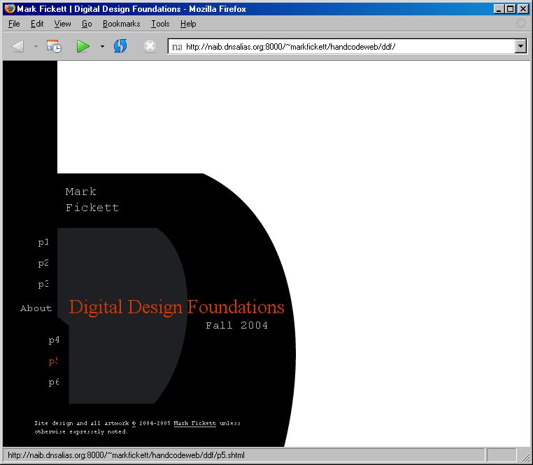
The look for the the gallery pages I'm going to use is here; after trying a number of different designs for the front page I settled on this one (note that the design is to be lower-left aligned). I've tried to include everything I'll need to worry about: normal and mouseover for menu links, text, thumbnails. I didn't put in in-text links, because I'm fairly confident that I'll come up with something acceptable on the fly. Lastly, I also wrote down the hexadecimal and RGB values of the colors I've used, other than black and white, and put them in comments at the top of my CSS file. (If you're not familiar with color values, now would be a good time to check out Westciv's section on color values.)
The first thing I'm going to do, actually, is not strictly CSS: I'm going to update the HTML so I'll be able to do what I want. This means dividing up the header a little more; specifically, adding spans around my first and last names, and around the date of the class, since I'm going to want to move those around separately. The result is this (separate file):
<!-- begin header.html -->
<div id="title">
<h1 id="classname">Digital Design Foundations</h1>
<h2>
<span id="firstname">Mark</span> <span id="lastname">Fickett</span>
<span id="classdate">Fall 2004</span>
</h2>
</div>
<!-- end header.html -->
Also before I begin, I've exported the various graphics I'll need, so they're ready to use. One image, for the background of the front page; one for the header of the gallery page, and two little corner-pieces for the upper left and lower right punch-outs on the gallery pages. I used GIF for all the images, since it's very efficient for vector-based, small-palette images. I would have preferred PNG for the punch-outs, since then they could have anti-aliased edges against any color using full-alpha transparency, but unfortunately PNG support is not great, notably in IE.
Now, ready to roll. (If you don't have the luxury of an easy means of uploading files to a web server as you work, and are planning to use SSIs, you may want to make an 'included' copy before writing the CSS.) First thing is to create a CSS file, and reference it in all the HTML files. The latter involves putting one of two things in the head section of the HTML document (between <head> and </head>).
Option one is embedding the stylesheet, which looks like this:
<style type="text/css">
<!-- /* keeps old browsers from getting confused */
body {
        ; /* useful stuff */
}
-->
</style>
I would recommend against it, since it involves adding the same code to every file — just the sort of thing we tried to avoid earlier with SSIs. Instead, we're going to use the link element to reference a separate file:
<link rel="stylesheet" type="text/css"
href="main.css" />
This will reference the file main.css, which is in the same directory as the HTML files. (I like to stick the link in right after the title; it should be fine anywhere in the head of the document.) Now that that's cleared up, on to the real thing; let's go with the front page first. I would highly recommend that you follow along; there's an 'included' copy of the index available if you don't have a page of your own going, and you can fill in an associated main.css as we go; that way you can see exactly what each step does, and try any different values you feel like.
Fire up whatever text editor you were using, and feed it your main.css. Mine starts like this, but is otherwise blank:
/* colors:
   summit orange:	d63800 / 214, 56,  0
   light gray:		?????? / 177, 177, 177
   dark gray:		1e2023 / 30,  32,  35
   and black, white
   */
The /* and */ are comment delimiters: everything between them, as should be familiar if you've done other programming, is ignored by anything but a human that's reading the code. In my case, I've put the colors I'm going to be using in a comment, for reference.
A quick note, before I start in on actually actually writing the code: I'm not going to worry about browser compatibility until I have everything pretty much figured out. I'm testing my code in Apple's Safari, so I'll expect to have to do some tweaking to make it work in Firefox and lots of work and/or frustration to make it presentable in Internet Explorer.
The first thing I want to talk about is the body at large. Web browsers have an annoying habit (well, useful sometimes) of giving the body a little bit of margin or padding by default. Since I'm laying out the whole page very carefully by hand, I'll have none of that. Also, I want the default text to be light grey (as defined above), Courier (or any monospace font), and 20 pixels tall. (There's some argument over which measurement units to use; for accessibility, it's nicer to use relative measurements, but for exact layout that matches up with your graphics pixels are most reliable. Of course, the Customer's Browser Settings are always right. See Westciv's length values section for details on all the options.) Lastly, I'm putting in the background image. In any case, the resulting code looks like this:
body {
	margin: 0px; padding: 0px;
	font-family: Courier, monospace;
	font-size: 20px;
	color: rgb(177,177,177);
	background: url(indexbg.gif) bottom left no-repeat;
}
What have I done? Why have I done it? Well, the first part of this ruleset (what a block like this in a stylesheet is called; for a very specific description of what pieces are called see the CSS2 specs Tokenization section), before the {, is a selector. In this case — just the name of the tag by itself — it selects the body element; that is, everything, until we override some of it; in CSS, things that are later and more specific override things that are earlier and more (or equally) general.
The second part of the ruleset is a number of declarations. Each declaration has the form property: value;, and whitespace (returns/newlines, spaces, tabs) doesn't matter. So: I've set the margin and padding for the page at large to zero (pixels — units aren't required with zero, but I'm in the habit of putting them in anyway). I set the font-family to Courier, or if that's not available, the browser will use any monospace font. I also set the font size to the aforementioned 20px, and the color using rgb(). (See Westciv's text style properties section for more detail.) I also set a number of background properties; I could have done it in a bunch of different declarations like background-position: bottom left; and background-repeat: no-repeat;, but I like to pack it in.
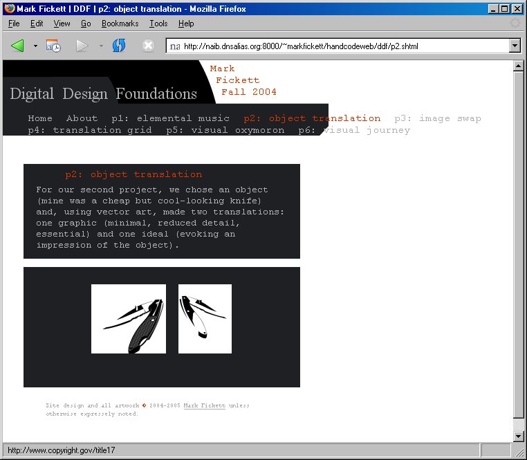
Here's the next batch (and a screenshot of the work-in-progress, if you aren't following along and want to know how it all looked):
#index #copyright, #classname, #firstname, #lastname, #classdate, #menu {
        position: absolute;     }
/* the foils of using predefined elements */
h1, h2 { font-weight: normal; font-size: inherit; }

#copyright {    font-size: 9px; width: 280px;   }
#classname {    font-family: "Times New Roman", serif; }

#index #copyright { bottom: 4ex; left: 90px;    }
#index #classname {     color: rgb(214,56,0); font-size: 28px;
                        left: 95px; bottom: 168px;      }
First: A new kind of selector. #something selects an element with id="something" as an attribute, and a comma-separated list selects everything in the list. #index #copyright is a descendant selector: it selects any instance of an element with id="copyright" inside (by however many layers) some other element with id="index". This is why I gave the body tags id attributes: I wanted to be able to reference elements on specific pages. (Westiv's selectors section has more.)
With all this fancy selecting, I did a couple things, the first of which was to make everything on the front page (and a fair number of things on the gallery pages) positioned absolutely. This means that the elements are stuck to the page, in some sense: I put them exactly where I want (in this case, over the background image), and they stay put, but follow — in this case — movements of the bottom-left corner of the window, meaning that resizing the window and thereby moving the background image also moves the absolutely positioned elements. There are three other ways of positioning, which we'll touch on more later; for now, slake your thirst with Westciv.
Having defined how the elements would be positioned, I then went on to position and style them; because the background is bottom-left aligned, and I want the elements to float on top of it, they're also positioned in terms of bottom and left. The styling is self-explanatory, perhaps with the exception of three things: font names with spaces in them are quoted (while un-spacey ones can be unquoted), inherit is a keyword for taking the parent's value (which using h1 and h1 upset), and ex is a new length value, which is in terms of the size of the lower-case letter x, whatever that happens to be in the current context. Having cleared that up, here's the next batch: a bunch more positioning (and yes, that is a lot of guess-and-check; I suppose I could figure it out beforehand), and some other stuff:
#index #firstname, #index #lastname {
        left: 90px; font-size: 18px;    }
#index #firstname { bottom: 355px; }
#index #lastname { bottom: 332px; }
#index #classdate { font-size: 16px; left: 290px; bottom: 165px;        }
Before I go on to the menu, I'm realizing that I'm doing a lot of stuff that not only will I want to not do (or undo) for the gallery pages, but it's costing me copious extra keystrokes. To solve that, I'm going to use the @import at-rule (as such things are called), leaving the basic applies-to-everyone things in main.css, creating a new file, font.css, and updating the HTML file accordingly. The old stylesheet looks like this:
body {
	margin: 0px; padding: 0px;
	font-family: Courier, monospace;
	font-size: 20px;
	color: rgb(177,177,177);
}

#classname, #firstname, #lastname, #classdate, #menu {
	position: absolute;	}
/* the foils of using predefined elements */
h1, h2 { font-weight: normal; font-size: inherit; }

#copyright {	font-size: 9px; width: 320px;	}
#classname {	font-family: "Times New Roman", serif; }
And the new home.css looks like this (as before, excluding my color-reference comments):
@import url(main.css);

body { background: url(indexbg.gif) bottom left no-repeat; }

#index #copyright { position: absolute;	}

#copyright { bottom: 4ex; left: 45px;	}
#classname {	color: rgb(214,56,0); font-size: 28px;
			left: 95px; bottom: 168px;	}
#firstname, #lastname {
	left: 90px; font-size: 18px;	}
#firstname { bottom: 355px; }
#lastname { bottom: 332px; }
#classdate { font-size: 16px; left: 290px; bottom: 165px;	}
And now, some excitement; here's what I'm doing with the menu, after updating menu.html to include class="plink" in all the links which are to project pages. (I may also have twiddled some previous positioning values.) Here is main.css and then home.css:
#menu a {       color: rgb(177,177,177); text-decoration: none;
                font-size: 15px;        }
#menu a:hover { color: rgb(214,56,0);   }
#menu { margin: 0px; padding: 0px;
        width: 78px; height: 100%;
        bottom: 0px; left: 0px;
        background: black;      }
#menu #home {   display: none;  }
#menu a { position: absolute;
        overflow: hidden; white-space: pre; }
#menu a.plink { width: 2.5ex; }
#menu a:hover { width: auto; }
	/* specific links positioned in relation to body, not menu */
#project1, #project2, #project3 { left: 50px; }
        #project1 { bottom: 285px; }
        #project2 { bottom: 255px; }
        #project3 { bottom: 225px; }
#project4, #project5, #project6 { left: 65px; }
        #project4 { bottom: 145px; }
        #project5 { bottom: 115px; }
        #project6 { bottom: 85px; }
#about { bottom: 190px; left: 25px; }
Most obviously, I've done a lot of positioning. I made the #menu behave (no margin or padding), then stretched and colored it to extend the vertical black stripe as befit the page scaling. I also did some formatting: colored the link text the usual grey, overrode the default underlining of links, and sized it (in the main stylesheet). Then I made the link to the home page not display for this page. Then I set up all the rest of the links to do what I want — a bit of trial and error to figure out what was going on. overflow: hidden; so I can cut off the description under normal circumstances, and white-space: pre; so that (like the code on this page) there aren't linewraps — in this case, so changing the width doesn't scrunch the text up, but rather cuts it off. Then I set the default width of all the class="plink"s to 2.5ex, so they just show the p#:. Finally, I used the link pseudo-class :hover so that on mouseover, they resume normal width.
On that note, I'll take care of the look of regular links, and have a nice segue into the gallery pages. Basically, link pseudo-class selectors allow you to talk about links in different states — sitting around, visited, moused over, being clicked on. Notably, they must be talked about in that order.
a {             color: rgb(177, 177, 177); text-decoration: underline;  }
a:link {        color: rgb(177, 177, 177); text-decoration: underline;  }
a:visited {     color: rgb(157, 157, 157); text-decoration: underline;  }
a:hover {       color: rgb(214,  56,   0); text-decoration: none;       }
a:active {      color: rgb(177, 177, 177); text-decoration: none;       }
I sometimes do crazy things with my links — dotted borders that change color or side when you mouseover and the like — but not today. See the text-decoration section at Westciv for details on the more traditional options. (Luckily for all of us, blink is not widely supported.)
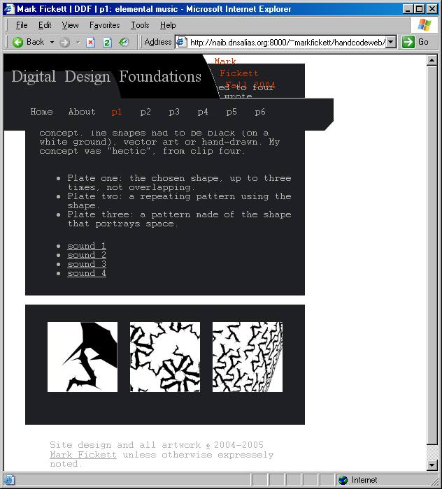
Now, time for the gallery pages; luckily, they'll all fall together. I've copied out an includedp6.html, for those who want to play with it(s CSS). Here's another screenshot for those curious to how it looks with only the CSS that carried over from the front page: not pretty. Anyway, here's what I'm doing to it concerning the header, after making a new gallery.css that @imports main.css (and updating the relevant HTML). The updated main.css, gallery.css following:
/* colors:
   summit orange:	d63800 / 214, 56,  0
   light gray:		?????? / 177, 177, 177
   dark gray:		1e2023 / 30,  32,  35
   and black, white
   */

body {
	font-family: Courier, monospace;
	font-size: 10pt;
	color: rgb(177,177,177);
}
body, #title, #menu {	margin: 0px; padding: 0px; }

a { color: rgb(177, 177, 177); text-decoration: underline; }
a:link { color: rgb(177, 177, 177); text-decoration: underline; }
a:visited { color: rgb(157, 157, 157); text-decoration: underline; }
a:hover { color: rgb(214,  56,   0); text-decoration: none; }
a:active { color: rgb(177, 177, 177); text-decoration: none; }

#classname, #firstname, #lastname, #classdate, #menu {
	position: absolute;	}
/* the foils of using predefined elements */
h1, h2 { font-weight: normal; font-size: inherit; }

#copyright {	font-size: 9px; width: 320px;	}
#classname {	font-family: "Times New Roman", serif; }

#menu {	margin: 0px; padding: 0px; }
#menu a {	color: rgb(177,177,177); text-decoration: none;
		overflow: hidden; white-space: pre;
		font-size: 15px;	}
#menu a:hover {	color: rgb(214,56,0);	}
a.plink { width: 2.5ex; }
And here's the new (and much improved) gallery.css:
/* colors:
   summit orange:	d63800 / 214, 56,  0
   light gray:		?????? / 177, 177, 177
   dark gray:		1e2023 / 30,  32,  35
   and black, white
   */

@import url(main.css);

#title {	position: absolute;
		top: 0px; left: 0px;
		width: 471px; height: 109px;
		background: url(header.gif) no-repeat;	}

#menu { top: 75px; left: 30px; }
#menu a {	display: inline-block;
		margin: 0ex 1ex 0ex;	}

#firstname, #lastname, #classdate {
		color: rgb(214, 56, 0); font-size: 15px; }
	#firstname { top: 3px; left: 300px; }
	#lastname { top: 20px; left: 308px; }
	#classdate { top: 37px; left: 316px; }

#classname {	font-size: 24px;
		left: 10px; top: 18px;
		word-spacing: .5ex;	}
That's a lot to chew on at once, at first glance. However, we've seen most of main.css before, and we'll go through gallery.css in smaller chunks.
For main.css, I scooted many properties of header links over from home.css, and combined zeroing margin and padding properties for the body, the header, and the menu. I also changed the basic font size to something a little smaller, and put it in the usual units — I don't care if it's not as exact as everything else.
Now, for gallery.css. Aside from a lot of positioning, as usual, and stuff we've seen before...
#menu a {       display: inline-block;
                margin: 0ex 1ex 0ex;    }
Here we have a new display type, inline-block. I used it because the menu links were refusing to cut off properly (obey what I wanted of width and overflow); display: block; fixed that, but then they stacked vertically, and to avoid having to position each link manually, I made them flow horizontally, like the default inline does. More on display types here.
To finish off the hands-free arrangement of the menu links, I set up their margins: the abbreviated forms are all-around (one value), top/bottom sides (two values), top, sides, bottom (three values), and top, right, bottom, left (four, clockwise from top) — so mine has an extra 1ex on either side.
The only other really exciting thing is word-spacing: .5ex; for the class name: it adjusts the track of the text (to use the technical term). Read all about it and other fun text-layout properties at Westciv's guide. Also, note that I specifically set the height and width of #title; since everything in it is absolutely positioned, it doesn't get stretched at all, and the background would be invisible were it not for explicit sizing. Now, on to adjusting the actual content of the site — the whole reason we're here! (Don't you wish you'd left it as an ugly HTML site and avoided all this trouble? Me neither. But actually, in many cases — and probably if you're not writing a tutorial while you write the code — there's less specific coding, more bang for your keystroke, and it moves faster.)
Before finishing up, I also shuffled the include for copyright.shtml inside the content div, so that it gets moved with the rest of the text (although it's still not inside the thumbnail or text blocks). Here's the semi-final gallery.css, less the comments at the top:
@import url(main.css);

#title {	position: absolute;
		top: 0px; left: 0px;
		width: 471px; height: 109px;
		background: url(header.gif) no-repeat;	}

#menu { top: 75px; left: 30px; }
#menu a {	display: inline-block;
		margin: 0ex 1ex 0ex;	}
#abt #about,
#p1 #project1, #p2 #project2, #p3 #project3,
#p4 #project4, #p5 #project5, #p6 #project6 { color: rgb(214, 56, 0); }

#firstname, #lastname, #classdate { color: rgb(214, 56, 0); font-size: 15px; }
	#firstname { top: 3px; left: 300px; }
	#lastname { top: 20px; left: 308px; }
	#classdate { top: 37px; left: 316px; }

#classname {	font-size: 24px;
		left: 10px; top: 18px;
		word-spacing: .5ex;	}

#content {	margin: 150px 30px 50px;
		padding: 0px;
		width: 400px;	}

#content div { background: rgb(30, 32, 35);
		margin: 2ex 0px; padding: 0ex 3ex 1ex;	}
#content div:first-child {
	background: url(upleftpunch.gif) no-repeat rgb(30, 32, 35);
	margin: 0px; } /* with no margin: 0, the bg goes away... */
#content h1 {	color: rgb(214, 56, 0); font-size: 1.1em;
		padding: 1ex 7ex 0ex; margin: 0px;	}
#content p { margin: 0px; padding: 1ex 0ex; }

/* doesn't override if not as specific, thus #content specified */
/* unfortunately, no 'precedes' adjacent or 'last-child' */
#content .thumbnails {	text-align: center;
		background: url(lowrightpunch.gif)
			no-repeat rgb(30, 32, 35);
		/* unhappy when all one piece */
		background-position: 100% 100%;
		padding: 20px 10px 40px; }

a img { border: 0px; }
.thumbnails img { max-width: 360px; margin: 5px; }

#content #copyright {	margin: 5ex;
			background: transparent;	}
To the menu section, I added a bunch of selectors with one color declaration; the descendant selectors select each link when it appears on the body with the associated name. I could've made them disappear, but since I'd already gone to the trouble of spacing them properly, I decided this would suffice:
#abt #about,
#p1 #project1, #p2 #project2, #p3 #project3,
#p4 #project4, #p5 #project5, #p6 #project6 { color: rgb(214, 56, 0); }
Now we start getting to the content. The margins are to get it below the header and spaced properly from the side; the padding is so we can be sure of what's going on with the divs inside it (which the margins on said divs take care of). Then I have a background on the #content-enclosed divs, but not on #content itself, so I can have the nice space between them. Now for something exciting:
#content div:first-child {
        background: url(upleftpunch.gif) no-repeat rgb(30, 32, 35);
        margin: 0px; } /* with no margin: 0, the bg goes away... */
This selects the div which is the first child of its parent, and which is in the content div. Then it sets its background and (for the commented reason) its margin, to get that nice little beveled corner.
The subtitle (h1 is its selector) doesn't have anything too new, except for the unit: font-size: 1.1em sets the font-size to 1.1 times the usual. Then this mess deals with the bevel in the thumbnail div — ideally, I would've selected the last div in #content, but although I played around with sibling selectors, no luck (I could select x-after-y, but not x-before-y). (If I really wanted, I could add a class="lastdiv" or something, but since I never have two thumbnail sections, this works well enough.)
/* doesn't override if not as specific, thus #content specified */
/* unfortunately, no 'precedes' adjacent or 'last-child' */
#content .thumbnails {      text-align: center;
                background: url(lowrightpunch.gif)
                        no-repeat rgb(30, 32, 35);
                /* unhappy when all one piece */
                background-position: 100% 100%;
                padding: 20px 10px 40px; }
Very similar to before, except this time I specified the position of the background image explicitly (and separately). As noted, it just didn't want to work when it was all one piece. Also as noted, it wasn't willing to select just .thumbnail, so I had to use the selector I did. I also decided to use text-align: center to center the thumbnails. A little tidying up — get rid of image borders, make sure no thumbnail sticks out of its section, make the thumbnails space nicely, size the copyright notice (again with a seemingly over-specific selector) and take out its background —
And it's time to see how it looks (or doesn't) in other browsers.
Unfortunately, it has some problems. Here are screenshots of how it looks in Firefox on Windows (front, gallery) (looks the same on Linux), and IE on Windows (front, gallery). In Firefox, the front page looks right except that the links are all cut off slightly, and don't expand when moused over; the gallery page's links aren't cut off at all (maybe I'll have to absolutely position them after all?), and the little corner-cops don't show at all. With IE, the mouseovers on the front page works, but the text size of the copyright is huge, the alignment of the title and date are messed up, and the menu isn't stretched vertically; the gallery page clips the menu links correctly, but doesn't care about the #content's top margin, and again is missing the punch-outs. Bummer, but not as bad as it could be. (Troubleshooting tip: try putting bright obvious borders on things, to see exactly where they think they are, and to make sure you can talk to them.)
Here are the fixes for the front page. Don't worry about resizing the links; just show what's being cut off, since resizing to 'auto' wasn't working. Give way to pixel-measurement so all the browsers see the right amount, even though ex-measurement would scale better. See that IE was just plain aligning the class name lower down, and scoot things a little. And see that the menu was being a flat little puddle in IE (again trying on a border), so give it an insanely huge inch value and trust monitors won't get that big too soon, since the percent value was ignored.
And here's what I've done for the gallery pages:
(I almost had a really cool fix for the whole link mouseover thing, using #menu a:hover:after { content: attr(title); }, putting the description of the "p#" in its title, and then having the title attribute put after it on mouseover... but IE doesn't do generated content.)
The final version of the site is here, and the fixes go as follows. I ended up having to do the menu with absolute positioning, much as it makes me sigh - though it's better for resizing text forcefully, I suppose. (Incidentally, it turns out IE does obey text size specifications — nice for me, not as nice for someone with bad eyes.) Then, because they were overflow: hidden and position: aboslute, Firefox was hiding the home and about links, so I had to make them wider explicitly.
I moved the #content div around a bit, since IE was sliding it under the header before, and resized (as noted) the oversize thumbnail on p6, since the max-width that was fitting it in properly was being ignored by IE, changed class="withtitle" to class="withhelp" in the HTML, since that's what I cared about, and gave it a similar look to the same on this page (although here it's for anything with a title). (See Westiv's UI properties for more about cursor, input fields, and the like.)
(I also added different sound-file format options on the p1 page, since before I only had Apple's AAC format, which isn't as portable.)
Finally, I separated out all the background properties for the sections I wanted the little bevel out of, and lo and behold every last browser did what I wanted... except that IE didn't want to listen to first-child, so I just made all the class="text" sections have the top-left punch-out. A mild sacrifice.
And now, after all that? My code's still relatively clean, and I have a page which looks how I want not only in my browser of choice, but on two other browsers people are likely to be using — and if that's any indication, hopefully on other ones (like Opera and Camino, among many choices), too. And since I wrote it using nice XHTML and neatly separated out my CSS, I know it'll be nice and navigable in lynx, too. I must say, though, that I prefer what we've hammered out here to the no-CSS version.
Other CSS to know
Although I didn't end up using it in this example, doing image mouseovers with CSS is very useful to know. It makes use of the :hover dynamic pseudo-class selector, and can either swap one background image for another (more straightforward), or can use one background image which has both states side by side, and shift it left/right (avoiding the flicker which is sometimes otherwise present). (I owe knowledge of the anti-flicker trick to skyzyx.com, the original description being available at WellStyled.com.)
Another of the many features of CSS I didn't end up using is z-index (Westciv link), which controls which element is on top when two overlap, similar to layers in Photoshop of similar applications. Using it, you can override the default stacking, and thus not worry about the order that (absolutely positioned) elements appear in the HTML as related to one appearing on top of the other.
Javascript
Again not used in my example, it's handy to know that Javascript can access CSS properties. Here's an example:
function changeColor() {
	thing = document.getElementById("thisone");
	thing.style.background = "rgb(214, 56, 0)";
	thing.style.color = "aqua";
	}
That would change the background and the foreground color of #thing when changecolor() was called. The Javascript could be embedded, or called from a separate file with something like <script type="text/javascript" src="sourcefile.js"></script> (omit the source attribute and put the code on the same page to embed it). To call the function, then add a link with the href attribute href="javascript:changeColor()". (Of course there's a huge amount more to Javascript, for which DevGuru provides a good reference, but that's a start.)
Java Applets
It's worth noting that the method of embedding Java applets in XHTML documents has changed; the applet tag has been depracated for XHTML 1.0 Strict, in favor of using object. For example, what used to be
<applet code="DrawLineApplet.class"codebase="Examples/DrawLine"
height="200" width="200"></applet>
should now be written as
<object classid="java:DrawLineApplet.class"codebase="Examples/DrawLine">
Text for non-java viewers.</object>
and, we hope, would have an accompanying entry in the stylesheet (and therefore perhaps an id attribute specified). HTML Ref provides a more detailed example of using object for a Java Applet. (Note that browser support for this is not full; for example, Safari 1.3 doesn't support object for Java Applets, although Firefox does.)
So now, you've built a page — or at least seen how it's done. You've seen how to make a simple, efficient, sensible HTML stricture, and a working but unattractive page like this, and then how to take it and use CSS to make it look nice, as I hope the final version does. I've given you hoards of links concerning XHTML and CSS, so you should have no trouble looking up what you don't know at this point. And check out the code for this and other documents (tips on doing that) and look at their stylesheets to see how it was done; find a page with a cool feature you want to emulate, and (assuming it's using CSS) copy it.
Also, if you're using the MacOS X IM client Adium, you now have all the tools you need in order to write message styles for it — though I also wrote a tutorial for that. And of course you could go on to bigger and better (or at least other) things, like Javascript ().